News — 2026.07.13
Dating TOWNCRAFT
by Its Tagsタグで読む、
TOWNCRAFTの年代
A Guide to Identifying Vintage TOWNCRAFT Name Tags 1940s–1980s
ヴィンテージ タウンクラフト ネームタグ判別ガイド 1940s–1980s
Born in 1927, TOWNCRAFT sent out countless garments as unsung everyday wear in mid-century America. At the collar of each one, a small piece of fabric is always sewn in. The name tag — it changed its look little by little over time, and today it is the most reliable clue to when a garment was made.
1927年に生まれたTOWNCRAFTは、ミッドセンチュリーのアメリカで、名もなき日常着として数え切れない衣服を送り出してきました。その首元には、いつも小さな布片が縫い付けられています。ネームタグ——それは時代とともに少しずつ姿を変え、いまでは一枚の服がいつ生まれたのかを教えてくれる、もっとも確かな手がかりになっています。
On the shelf of a vintage clothing shop, or on a piece you already own. Reading a tag is also a way of quietly facing the era in which the garment was made. As the official site of a brand that has continued since 1927, we have organized the knowledge built up among enthusiasts over the years and present it here.
古着店の棚で、あるいはお手元の一枚で。タグを読むことは、その服が仕立てられた時代と静かに向き合うことでもあります。1927年から続くブランドの公式サイトとして、これまで愛好家のあいだで積み重ねられてきた知見を、ここに整理してお渡しします。
Note: The dates in this guide are approximate. Tag changes had transition periods, and several versions can exist side by side in the same era. Allowing for differences between individual pieces, please look at several clues together.
〔注記〕本ガイドの年代は、おおよその目安です。タグの切り替えには移行期があり、同じ年代でも複数の仕様が併存することがあります。個体差を前提に、複数の手がかりを重ねてご覧ください。
01 — How to Read
The basics — two points to look at読み方の基本——ふたつの視点
There are two points to understand first when reading the era of a tag.
年代を読むうえで、まず押さえておきたい視点がふたつあります。
Point 1: How the seller’s company name is written視点1:販売元の社名表記
Early tags carry the brand name alone, and the seller’s company name appears nowhere on them. The company name began to appear alongside the brand name from the 1950s on. Its styling then moved from an era of “all capitals” to an era of “initial capitals only,” and in 1971 the way the company name was written changed altogether. Whether the company name is there, and how it is written — this is the first key to telling the eras apart.
初期のタグはブランド名だけで完結しており、販売元の社名はどこにも入っていません。社名が併記されるようになるのは1950年代以降のこと。しかもその表記は、「すべて大文字」の時代から「頭文字のみ大文字」の時代へと移り、1971年には社名の表記そのものが変わります。社名の「有無」と「書かれ方」——これが年代を分ける第一の鍵です。
On this page, photos of actual surviving pieces are shown with the [Actual tag] mark.
本ページでは、現存する個体の実物写真を〔実物〕の印とともに掲載しています。
Point 2: Whether there is an ® mark視点2:®マークの有無
The ® mark, which indicates a registered trademark, is not seen on tags from the early 1940s. It began to appear in the late 1940s and became established on the tags that followed. Combining it with how the company name is written makes dating more accurate.
登録商標を示す®マークは、1940年代前半のタグには見られません。1940年代後半から付くようになり、以降のタグでは定着していきます。社名表記と組み合わせることで、判別の精度が上がります。
02 — 1940s
1940s — The era of the brand name alone1940年代——ブランド名だけの時代
What the tags of this era have in common is that they carry the brand name alone. The seller’s company name is not yet anywhere on them.
この時代のタグに共通するのは、ブランド名だけで完結していることです。販売元の社名は、まだどこにもありません。
Script tag筆記体タグ
A tag with the brand name woven in flowing script. A design that suggests handwriting rather than type is particular to this era.
ブランド名を流れるような筆記体で織り出したタグです。活字ではなく手書き文字を思わせる意匠は、この時代ならではのものです。
DE LUXE tagDE LUXEタグ
A tag with the words “DE LUXE” set alongside decorative motifs such as a crown or palm trees. As the name suggests, its ornate design catches the eye.
王冠や椰子の木といった装飾的なモチーフとともに、「DE LUXE」の文字が添えられたタグです。名称のとおり、華やかな意匠が目を引きます。
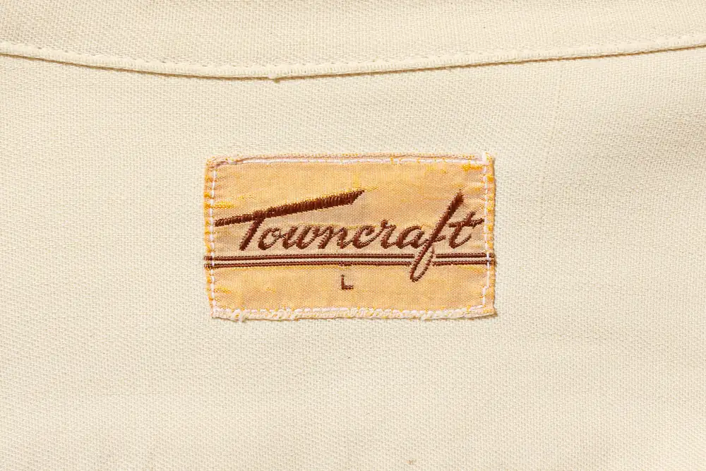
Actual tag実物c.1940sScript tag — a design from the earliest period, in flowing script. No company name anywhere筆記体タグ——流麗なスクリプトによる最初期の意匠。社名はどこにもない
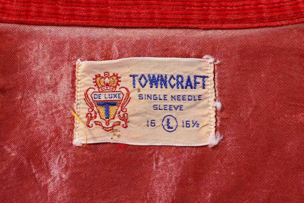
Actual tag実物c.1940sDE LUXE tag — an ornate piece with a crowned crestDE LUXEタグ——王冠の紋章を添えた華やかな一枚
What to look for• No seller’s company name on the tag → possibly from the 1940s or earlier
• Without an ® mark, roughly the early 1940s; with one, roughly the late 1940s to the early 1950s
見るべきポイント・タグに販売元の社名が入っていない → 1940年代以前の可能性
・®マークがなければ1940年代前半、あれば1940年代後半〜1950年代初期の目安
03 — 1950s–60s
1950s–60s — The company name appears in “all capitals”1950〜60年代——社名が「全大文字」で入る
From this period, the seller’s company name appears alongside the brand name. It is written entirely in capitals. This is what separates it from the later eras.
この時期から、ブランド名とともに販売元の社名が併記されるようになります。表記はすべて大文字。ここが、のちの時代との分かれ目です。
WASHABLE tag / MACHINE WASHABLE tagWASHABLEタグ/MACHINE WASHABLEタグ
In this version, wording that shows the garment is “washable” is woven into the tag itself.
「洗える」ことを示す表記をタグそのものに織り込んだ仕様です。
SANFORIZED tagSANFORIZEDタグ
“SANFORIZED” is a marking showing that the fabric has been given an anti-shrink treatment. This tag also carries an ® mark (its position varies from piece to piece).
「SANFORIZED」は、生地に防縮加工が施されていることを示す表示です。このタグにも®マークが入ります(付く位置には個体差が見られます)。
P tag / Ship tagPタグ・船タグ
The P tag, with a “P” on the left side, comes in a triangular variation in addition to the usual rectangular one. The ship tag, which places a ship design in the background or on the left, is a pictorial tag and one of the tags that symbolize this period.
左側に「P」をあしらったPタグには、通常の四角いものに加え、三角形のバリエーションが存在します。背景や左側に船の意匠を配した船タグは、図柄の入るタグとして、この時期を象徴するもののひとつです。
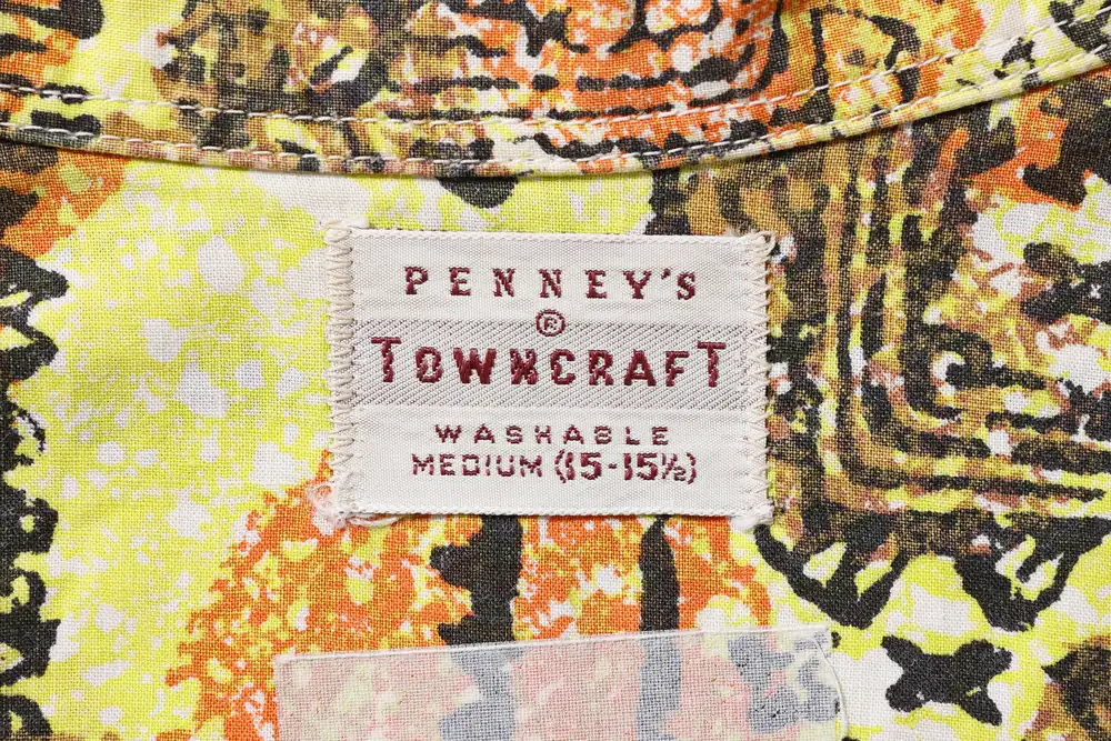
Actual tag実物c.1950s–60sWASHABLE tag — company name in all capitals, with an ® markWASHABLEタグ——社名は全大文字、®マークを伴う
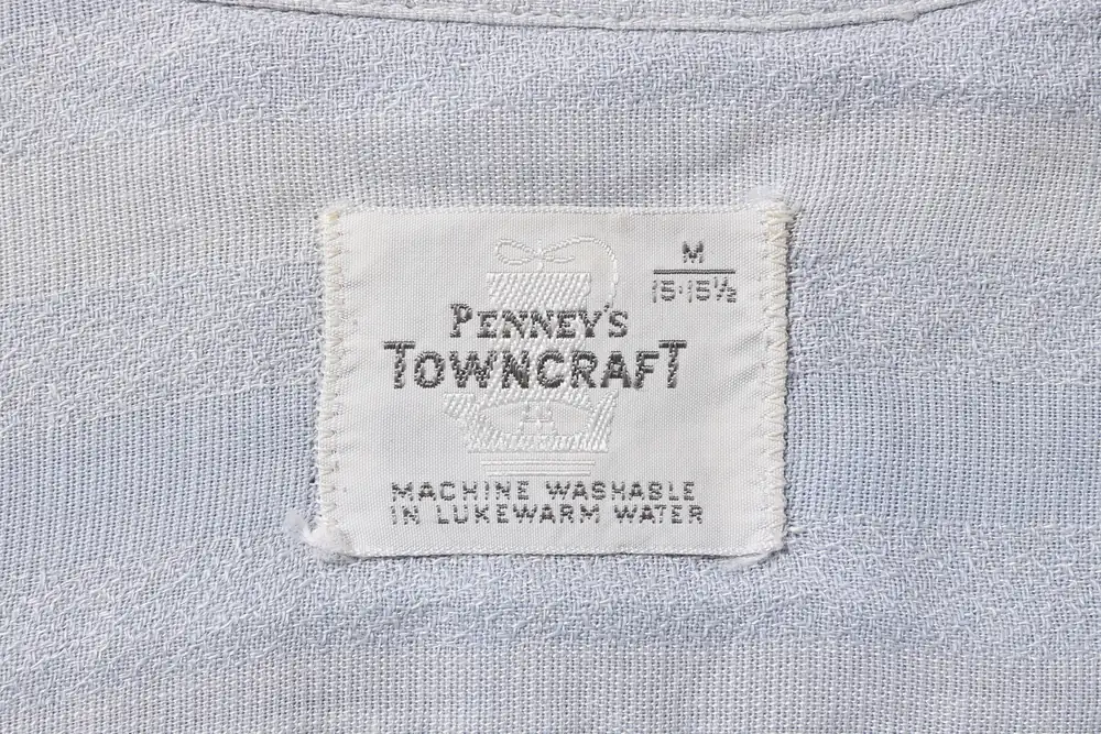
Actual tag実物c.1950s–60sMACHINE WASHABLE tag — functional wording layered over a tone-on-tone weaveMACHINE WASHABLEタグ——同色の透かし織りに機能表示を重ねる
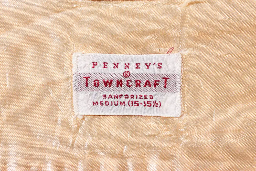
Actual tag実物c.1950s–60sSANFORIZED tag — a piece with the anti-shrink treatment marking woven inSANFORIZEDタグ——防縮加工の表示を織り込んだ一枚
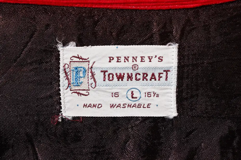
Actual tag実物c.1950s–60sP tag — a “P” design on the left. Triangular variations exist as well as rectangular onesPタグ——左に「P」の意匠。四角に加え三角形のバリエーションも
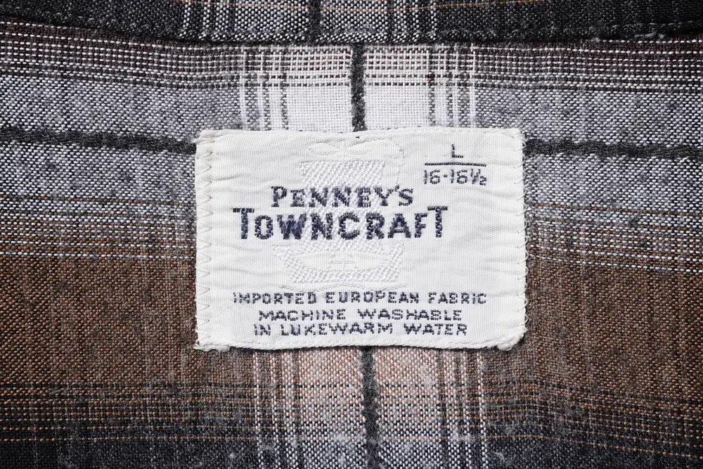
Actual tag実物c.1950s–60sShip tag — a pictorial piece with a ship design laid faintly in a tone-on-tone weave船タグ——船の意匠を同色の織りで薄く敷いた図柄入りの一枚
What to look for• The seller’s company name appears in “all capitals” → roughly the 1950s–60s
• Functional wording such as WASHABLE / SANFORIZED begins to appear on tags
見るべきポイント・販売元の社名が「すべて大文字」で入っている → 1950〜60年代の目安
・WASHABLE/SANFORIZEDなど、機能表示がタグに現れはじめる
04 — 1960s–70s
1960s–70s — The company name changes to “initial capitals only”1960〜70年代——社名が「頭文字のみ大文字」に
The company name changes from all capitals to initial capitals only. It is a small difference, but a reliable marker for telling the eras apart.
社名の表記が、全大文字から頭文字のみ大文字へと変わります。小さな違いですが、年代を分ける確かな指標です。
Plus tagPlusタグ
A tag with a crown on the left and the word “Plus” at the upper right. Blue, red and black versions are known.
左に王冠、右上に「Plus」の表記を配したタグです。青・赤・黒の展開が知られています。
PENN-PREST tag / PAR EXCELLENCE tagPENN-PRESTタグ/PAR EXCELLENCEタグ
The PENN-PREST tag is based on red. “PENN-PREST” is the name of a finishing process printed on the tag, indicating a permanent-press treatment that keeps the garment’s shape after washing. The PAR EXCELLENCE tag is based on black.
赤を基調とするのがPENN-PRESTタグ。「PENN-PREST」は、洗濯後も形状が保たれるパーマネントプレス加工を示す、タグに印字された加工技術名です。黒を基調とするのがPAR EXCELLENCEタグです。
White tag for sweatersセーター用の白タグ
Sweaters used a tag with a white ground. Along with the material wording, a design featuring a crown can be seen.
セーターには、白地のタグが用いられました。素材表記とともに、王冠をあしらった意匠が見られます。
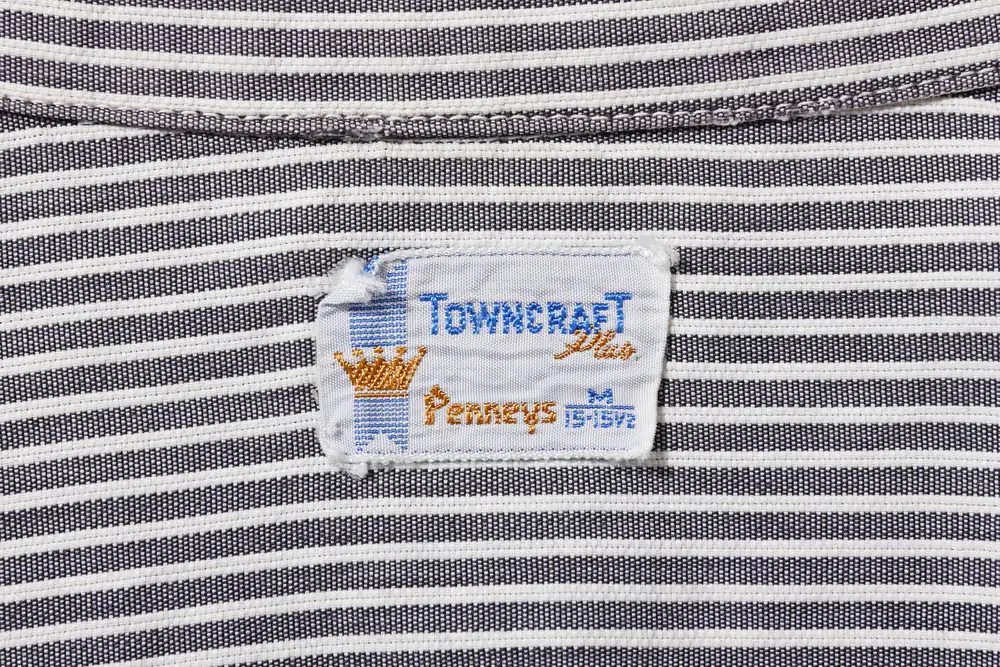
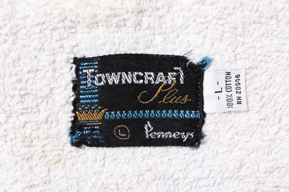
Actual tag実物c.1960s–70sPlus tag — a crown on the left and “Plus” in script. Color variations exist, including blue, red and blackPlusタグ——左に王冠、筆記体の「Plus」。青・赤・黒など配色のバリエーションが存在
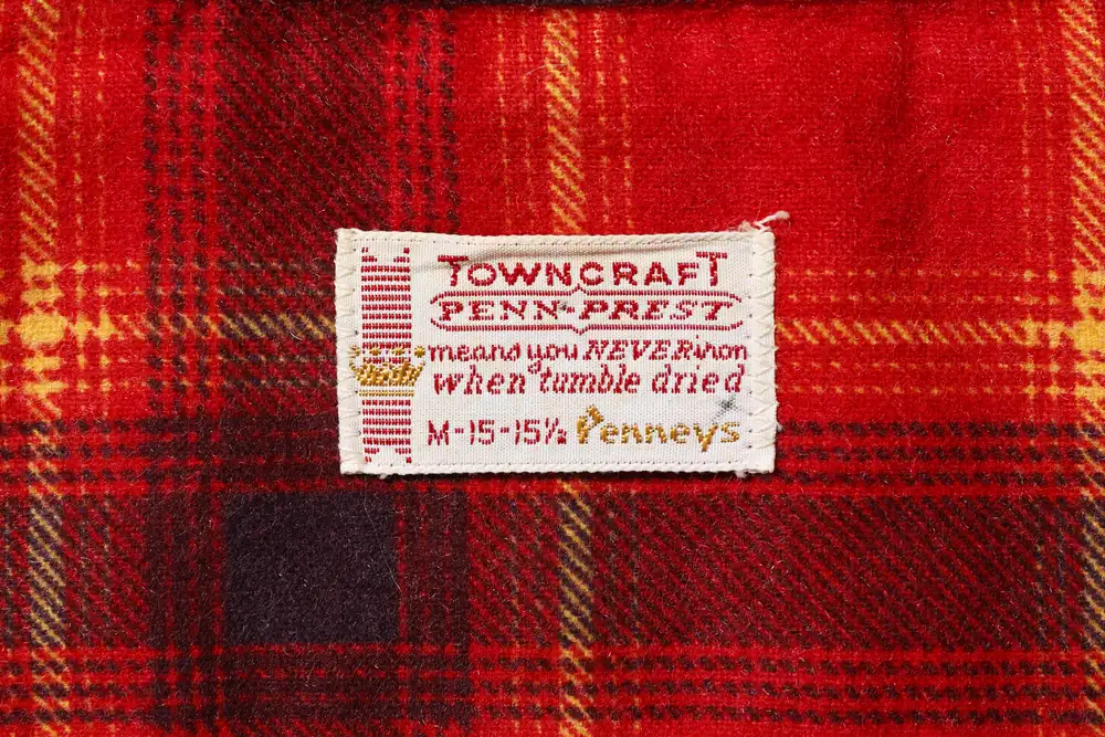
Actual tag実物c.1960s–70sPENN-PREST tag — red-based. The process name is framed, with a crown addedPENN-PRESTタグ——赤基調。加工技術名を枠で囲い、王冠を添える
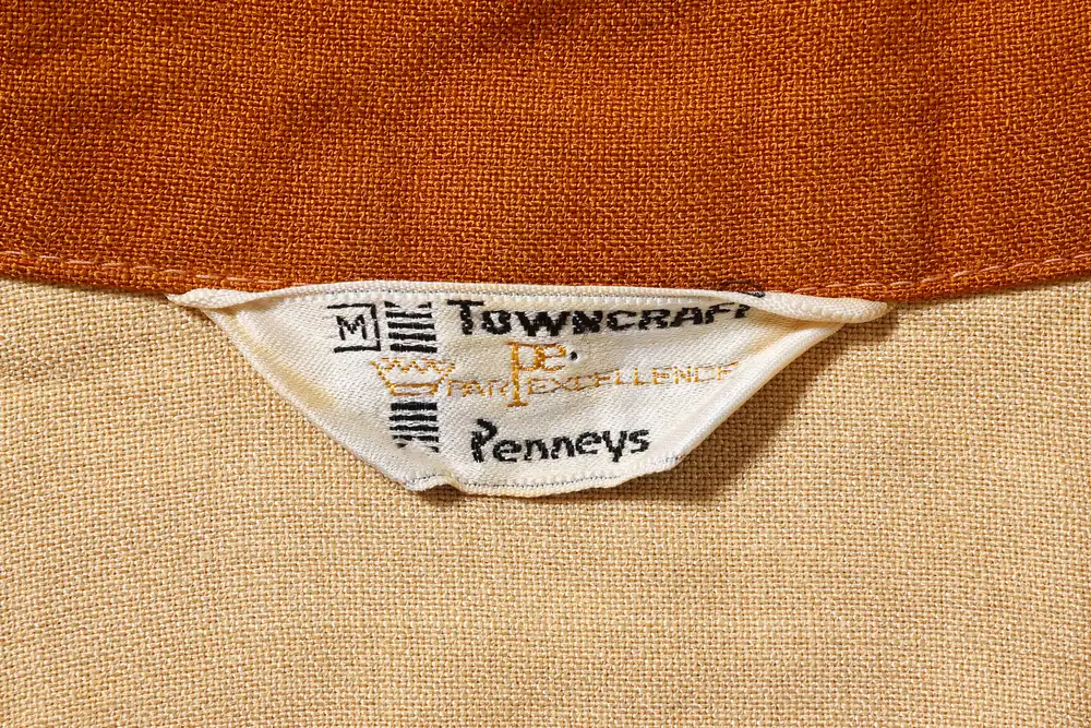
Actual tag実物c.1960s–70sPAR EXCELLENCE tag — a gold-thread “pe.” monogram and a crown. Pieces on a white ground also existPAR EXCELLENCEタグ——金糸の「pe.」モノグラムと王冠。白地の個体も存在
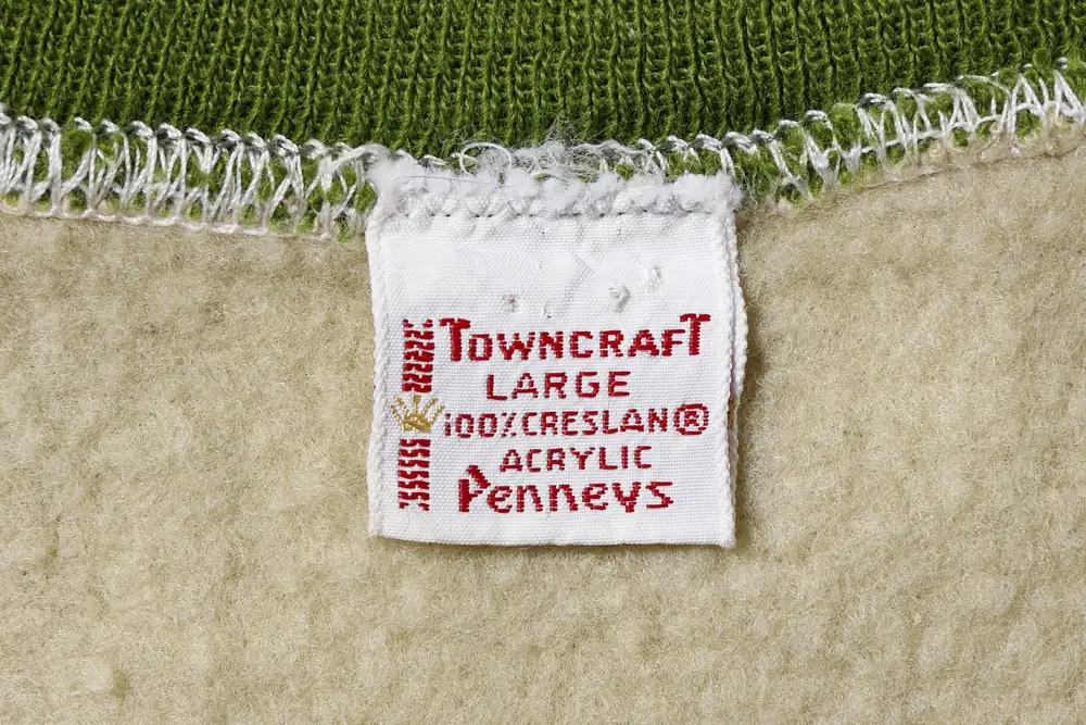
Actual tag実物c.1960s–70sWhite tag for sweaters — red thread on a white ground, with material wording and a crownセーター用の白タグ——白地に赤糸。素材表記と王冠を伴う
What to look for• Only the initial letters of the company name are capitals → roughly the 1960s–70s
• There are more variations in ground color and added wording, such as Plus / PENN-PREST / PAR EXCELLENCE
見るべきポイント・社名の頭文字だけが大文字 → 1960〜70年代の目安
・Plus/PENN-PREST/PAR EXCELLENCEなど、地色や付記表記のバリエーションが広がる
05 — 1970s
1970s — The black era1970年代——黒の時代
Black tag黒タグ
A tag with a solid black ground. The seller’s company name appears small at the lower left. A triangular variation exists in addition to the rectangular one.
地色が真っ黒なタグです。左下に販売元の社名が小さく入ります。四角いものに加え、三角形のバリエーションが存在します。
Note that the way the seller’s company name was written changed in 1971, and this difference is also a clue for telling apart tags from around the 1970s.
なお、1971年に販売元の社名表記が変更されており、この違いも1970年代前後を分ける手がかりになります。
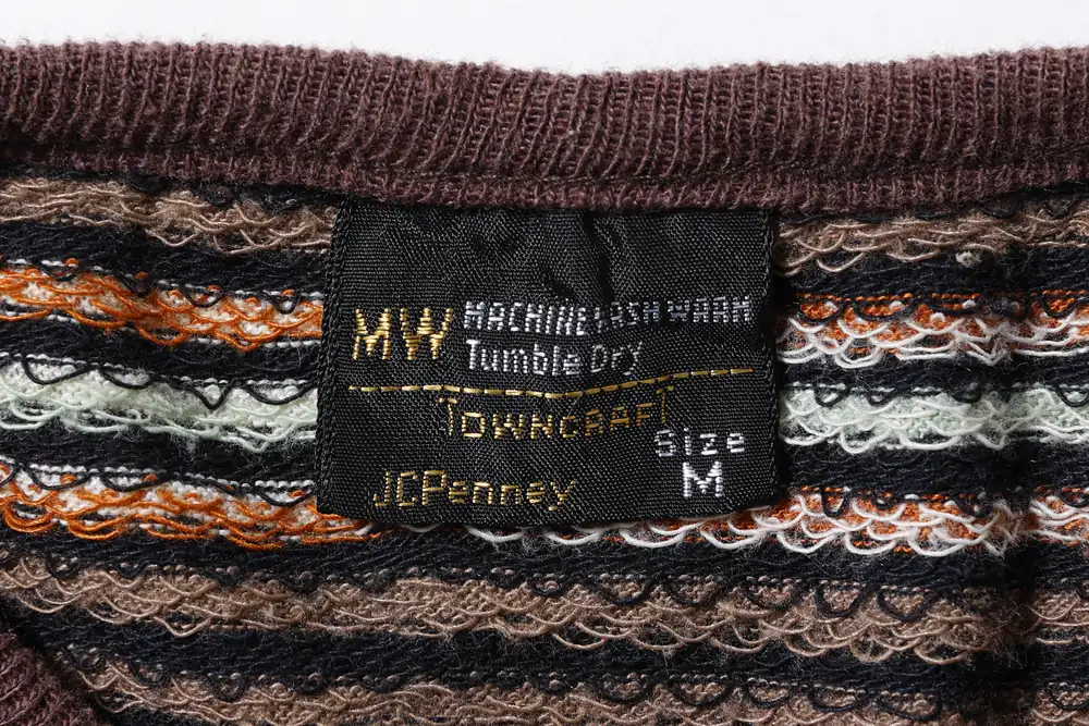
Actual tag実物c.1970sBlack tag — a solid black ground with the company name at the lower left (the new styling from 1971 on). A triangular version also exists黒タグ——真っ黒な地に左下の社名(1971年以降の新表記)。三角形版も存在
What to look for• Solid black ground + company name at the lower left → roughly the 1970s
• Whether the company name is written the old way or the new way lets you estimate whether a tag is from before or after 1971
見るべきポイント・真っ黒な地+左下の社名 → 1970年代の目安
・社名の表記が旧いか新しいかで、1971年の前後を推し量れる
06 — 1980s
1980s — On to the blue tag1980年代——青タグへ
Blue tag青タグ
In the 1980s, tags moved to a new design based on blue. This is the most recent generation counted as vintage.
1980年代には、青を基調とした新しいデザインのタグへと移行します。ヴィンテージとしてはもっとも新しい世代にあたります。
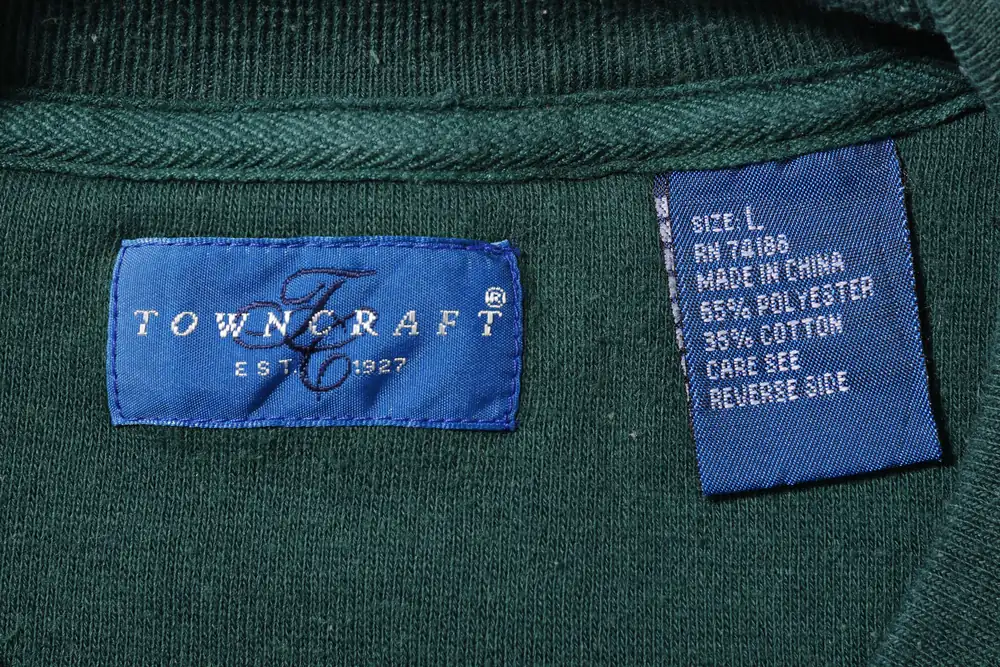
Actual tag実物c.1980sBlue tag — a new design on a blue ground, with the wording “EST. 1927”青タグ——青地の新デザイン。「EST. 1927」の表記が入る
What to look for• A new design on a blue ground → roughly the 1980s
見るべきポイント・青地の新デザイン → 1980年代の目安
07 — Quick Chart
Quick reference chart年代早見表
| Era年代 | Typical tags代表的なタグ | Clues for dating判別の手がかり |
|---|---|---|
| Up to the early 1940s〜1940年代前半 | Script tag, DE LUXE tag, block-letter tag (no ®)筆記体タグ・DE LUXEタグ・ブロック体タグ(®なし) | No seller’s company name. No ® mark販売元の社名なし。®マークなし |
| Late 1940s to early 1950s1940年代後半〜50年代初期 | Block-letter tag (with ®)ブロック体タグ(®あり) | Still no company name; the ® mark is added社名なしのまま、®マークが加わる |
| 1950s1950年代 | NUCRAFT collar tagNUCRAFTコラータグ | For collars, no company name, with ®, text-heavy襟用・社名なし・®あり・文章多め |
| 1950s–60s1950〜60年代 | WASHABLE / MACHINE WASHABLE, SANFORIZED, P tag, ship tag, tag for robesWASHABLE/MACHINE WASHABLE・SANFORIZED・Pタグ・船タグ・ガウン用タグ | Seller’s company name in “all capitals”販売元の社名が「全大文字」で入る |
| 1960s–70s1960〜70年代 | Plus tag (blue, red, black), PENN-PREST, PAR EXCELLENCE, TAPERED, printed tag for sweatshirts, white tag for sweatersPlusタグ(青・赤・黒)・PENN-PREST・PAR EXCELLENCE・TAPERED・スウェット用プリントタグ・セーター用白タグ | Company name in “initial capitals only”社名は「頭文字のみ大文字」 |
| 1970s1970年代 | Black tag, printed tag for T-shirts黒タグ・Tシャツ用プリントタグ | Black ground, company name at the lower left. The company name styling changed in 1971黒地・左下に社名。1971年に社名表記が変更 |
| 1980s1980年代 | Blue tag青タグ | New design on a blue ground青地の新デザイン |
* Photos marked [Actual tag] are examples of surviving pieces. Tag changes had transition periods, and details vary between pieces even within the same version. For reference in dating, the chart also includes versions not shown in photos in the text (block-letter tag, NUCRAFT collar tag, tag for robes, TAPERED tag, printed tags, etc.).
※ 〔実物〕と記した写真は、現存する個体の一例です。タグの切り替えには移行期があり、同じ仕様でも細部には個体差が見られます。早見表には、本文で写真を掲載していない仕様(ブロック体タグ・NUCRAFTコラータグ・ガウン用タグ・TAPEREDタグ・プリントタグ等)も、判別の参考として含めています。
Afterword
In closing結びに
Once you have read the tag, please go back to the garment itself. The firmness of the fabric, the way the stitches run, the plain tailoring — what lies beyond the era the tag points to is the “goodness of the ordinary” that stays the same in every era. The current collection quietly carries on what began in 1927.
タグを読み終えたら、どうぞ服そのものに戻ってください。素材の張り、縫いの運び、飾らない仕立て——タグが指し示す年代の向こうにあるのは、いつの時代も変わらない「普通の良さ」です。1927年にはじまったその続きを、現在のコレクションが静かに引き受けています。
The brand’s story is on About, and its changes by era and the archive are on History. Please take a look at them as well.
ブランドの歩みは About に、年代ごとの変遷とアーカイブは History にまとめています。あわせてご覧ください。
Some current TOWNCRAFT products have a decade in the product name, such as “50S” or “60S.” These are new products, not vintage clothing from that time. Ombre shirts are gathered on the Ombre Shirts list, and other new items on New Arrivals. New Arrivals also includes ONE IN THE WORLD, one-of-a-kind pieces made by reworking archive items and samples.
TOWNCRAFTの現行品には、「50S」「60S」のように年代を商品名に入れたものがあります。これらは当時の古着ではなく、新品です。オンブレシャツは オンブレシャツ一覧 に、ほかの新作は New Arrivals にまとめています。New Arrivals には、アーカイブやサンプルに手を加えた一点物の ONE IN THE WORLD も並んでいます。
Check the small tree rings at the collar with your own hands.
Pieces that carry their era are also in the online store.
首元の小さな年輪を、あなたの手で確かめる。
年代を宿した一枚は、オンラインストアでも。